
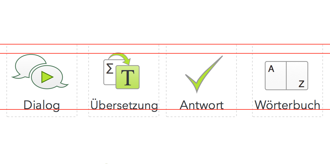
Our language learning courses are now spread over various media including: online, chrome apps, desktop downloads and apps: Android and iOS. In an attempt to reach some consistency over the different platforms, we’ve started redesigning the icons.
The icons are crucial for interacting with the content and the software. The icon needs to be easily recognisable and enticing to click on.
This time we started at a much higher resolution.
Previously, we would just export at the standard 72 dpi and at the correct size. However now that many screens have higher resolutions, including the retina displays on laptops and mobile devices, these icons looked bitty compared to the rest of the interface. They also needed a refresh.
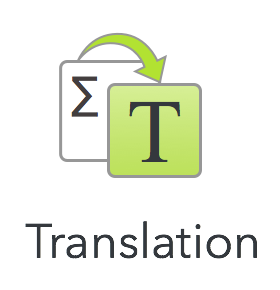
Perhaps one of the trickiest icons to create was the translation button. Translating is quite an abstract concept because you are, in effect, trying to convey three separate concepts in one: the original language, your mother language and the process of translation. This was further complicated by the fact that we have various language courses and is translated into various mother languages. The Turkish course alone, for example, is translated into English, German, Italian, Dutch, French and Spanish. So wehereas we previously used the flag (e.g. the UK flag for English), we decided that we would use one icon for all language course, for all mother languages.
I started of with the Greek letter Sigma.
Greek is often used in many languages to signify an incomprehensible language – It’s all Greek to me. I chose Sigma because it is also the mathematical letter for ‘total’. So, everything would be translated.
I then created the green arrow to signify the before and after process. I made this green to signify fresh, new. The tapered arrow also shows movement and dynamism.
I started with the Roman letter S, as being the equivalent of the Sigma. For some reason, I wasn’t too happy with this choice, not too sure why, but I thentried the T. I was a lot happier with this. The T, first of all, had the connection with Translation, in English at least. But the letter is also used across the board by software tools to symbolise Text.
I then gave the mother language square dominance by filling it with the same fresh green background.We also use green for the translation windows. I tried lightening the Sigma to a light grey text but this diminished its importance too much.
The new translation button will be released first in the updated Turkish Android App!

Learn a language with LearnOasis – learn online or download our comprehensive language learning apps!